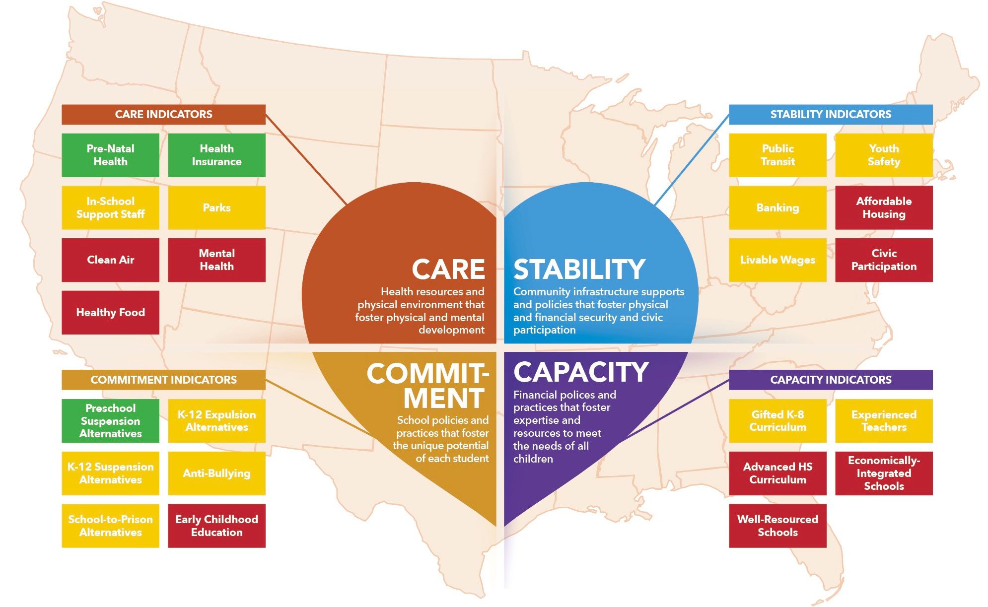
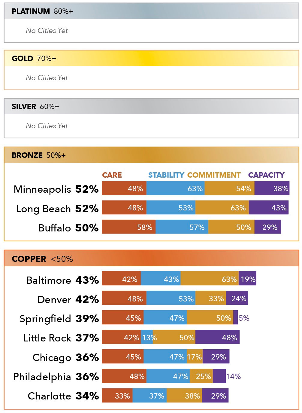
Loving Cities Index Scores
The 24 indicators measured through the Index are listed in the chart below. The colors represent how well cities are doing at providing equitable access to each critical resource/support:
- Green means nearly all ten cities studied provide strong levels of access and equity to supports.
- Yellow means that some cities provide strong levels of access while others do not.
- Red means nearly all ten cities provide weak levels of access to supports.